
Reading the results
Every Monte Carlo output explained: the key metrics, return and drawdown scenario cards, the equity-path band chart, and the two distributions.
A finished run produces four blocks, top to bottom: Key Metrics, Return Scenarios, Drawdown Scenarios, and the charts (Portfolio Growth + Distributions). Here's how to read each.
First: what the percentages mean
The scenario cards are labelled 5% / 50% / 95%. Those are percentiles, not probabilities of an event. Rank every simulated future from worst to best: the 5% card is the point where only 5% of futures came out worse, the 50% card is the middle one (half better, half worse), and the 95% card is the point where only 5% came out better.
Two consequences worth internalizing:
- Worst Case (5%) is not the worst case. It's the boundary of the worst 1-in-20. Twenty-odd simulated futures were worse — the Absolute Worst card shows the most extreme single one.
- Worst Case DD (95%) is the number to size against. 95% of futures had a shallower drawdown; one in twenty had a deeper one. Sizing against the median drawdown guarantees you'll be uncomfortable half the time.
Key Metrics
| Card | Meaning |
|---|---|
| Avg. Net Profit | Average ending value minus initial capital, across all simulations. |
| CAGR | Compound annual growth rate of the average ending value. |
| Expected DD | The average maximum drawdown across all simulations, in % and $. Note this is the expected (typical) worst valley — half your simulated futures were worse than the median drawdown. |
| MAR Ratio | CAGR ÷ expected drawdown, the risk-adjusted one-number summary of the simulated distribution. |
| Prob. of Profit | The share of simulations ending above starting capital. The app caps the display at ">99%" — and its own help text is worth internalizing: paths are resampled from the backtest window, so they can't contain conditions that window never saw. This is not a forecast. |
Return Scenarios (CAGR)
Five cards slice the distribution of terminal values: Absolute Best, Best Case (95%), Most Likely (50%), Worst Case (5%), Absolute Worst — each as an annualized growth rate with the terminal dollar value. The 5%/95% cards are the useful pair: together they bracket the middle 90% of simulated futures. The absolutes are single most-extreme paths — anecdotes, not planning numbers.
Screenshot pending: the Monte Carlo result cards are being re-captured for the docs.
Drawdown Scenarios

The same slicing applied to each path's maximum drawdown: Absolute Best DD (mildest ever), Best Case DD (5%), Typical DD (50%) (median), Worst Case DD (95%), Absolute Worst DD (deepest ever).
This row is the reason to run the simulation at all. The question to answer honestly: could I keep trading the system through the Worst Case DD (95%) number? If not, the construction is oversized for you — go back to the Builder and scale down before the market runs the experiment for you.
Portfolio Growth — simulated equity paths
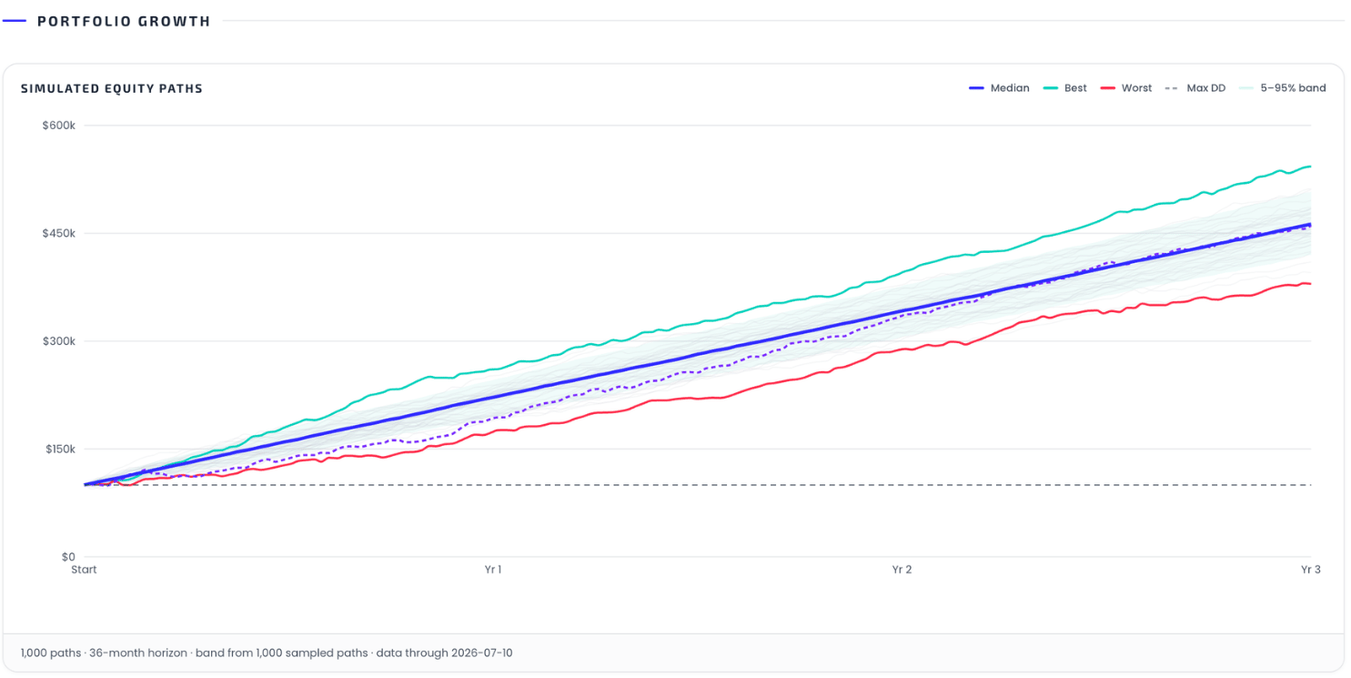
The band chart compresses every path into one picture:
- Median line — the 50th percentile at each point in time.
- 5–95% band — where 90% of paths lived at each step.
- Best / Worst lines — the single best and worst terminal paths.
- Max DD line (dashed) — the path containing the deepest drawdown, which is usually not the worst terminal path: a path can end fine and still have been horrible to live through.
- The faint lines are individual sampled paths; the dashed horizontal line is your starting capital.
The footer states the run's facts: paths, horizon, injected events, and the data-through date.
Distributions
Two histograms with 5th/50th/95th percentile markers:
- Return distribution — cumulative return over the horizon across paths.
- Drawdown distribution — each path's max drawdown. Typically right-skewed: a long tail of rare-but-deep valleys. The tail is the part worth staring at.
Get the weekly 0DTE research email
Research notes and product updates, straight to your inbox. Unsubscribe anytime.