
Compare
Put up to three saved portfolios side by side — same timeframe, same metrics, best value per metric starred — and see which construction actually holds up.
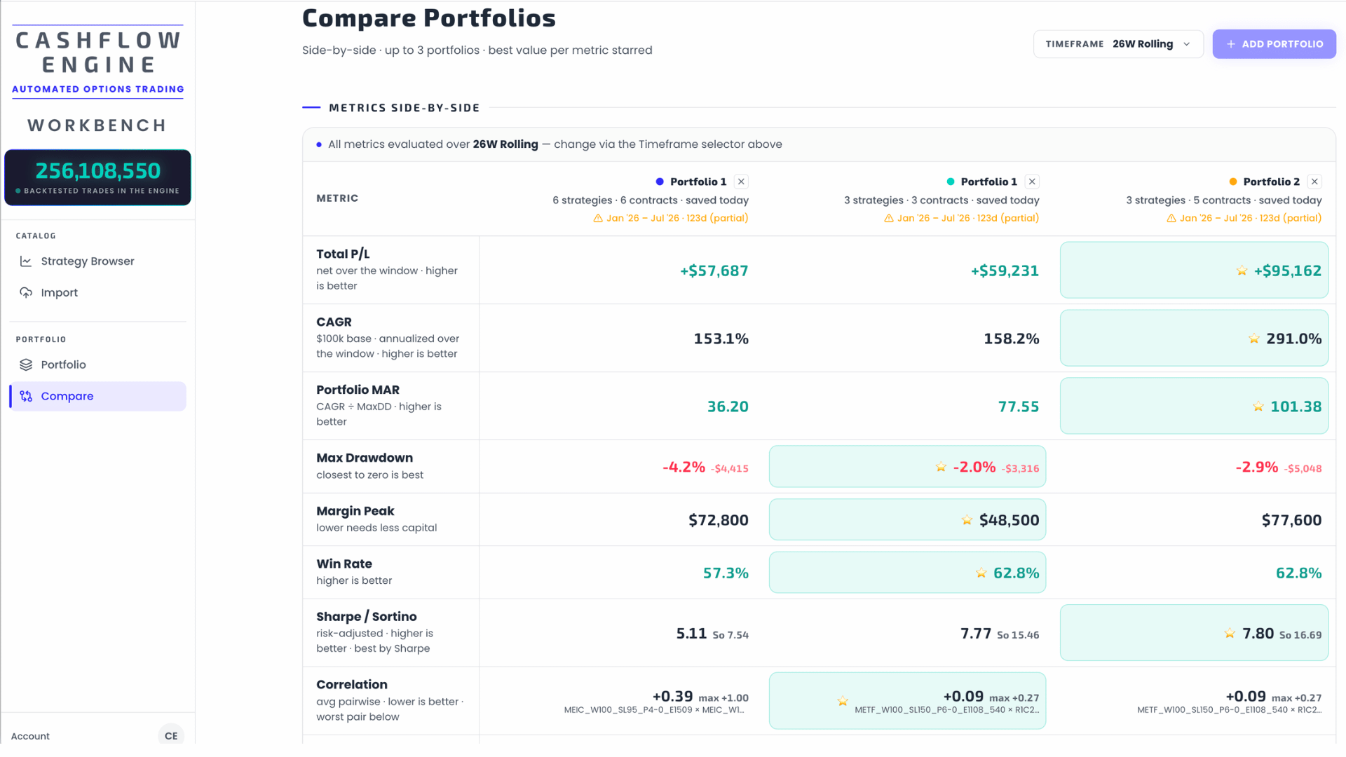
Compare answers the question the Builder can't: which of my constructions holds up across the board? It renders up to three saved portfolios side by side over one shared timeframe — same metrics, same charts — and stars the best value in every row.
Adding portfolios

+ Add Portfolio opens a picker with your saved portfolios (build and save them in the Portfolio Builder) and your uploaded backtests — picking an uploaded backtest materializes it into a saved portfolio first, so everything compared is a portfolio. Each slot gets a fixed color; the ✕ on a column removes it.
Each column header shows the portfolio's shape — strategies, contracts, save date — plus the evaluated date range. A partial-window warning appears when a portfolio's data covers less of the timeframe than the others: metrics over different effective windows are not a fair fight, and the header says so.
One timeframe for everything
The Timeframe selector (default 26W) applies to every metric and chart on the page — the same rolling windows (1W–52W) and calendar periods (1M–24M, Total) as everywhere else in the Engine. An info strip above the table restates the active window so a screenshot can't mislead.
What "best" means
The star marks the best value per row: highest for return-type metrics, closest to zero for drawdown, lowest for margin and correlation, and none for trade count (sample size has no winner). A portfolio that collects stars across different kinds of rows — return, risk, capital — is genuinely dominant. One that only stars the return rows is just the most aggressive.
Details of every row and the overlay charts: Metrics table & overlays.
Get the weekly 0DTE research email
Research notes and product updates, straight to your inbox. Unsubscribe anytime.