
Analytics charts
The Analytics charts explained: equity curve vs SPX, drawdown, margin usage, monthly returns, correlation, entry time × weekday P/L, and Risk Contribution.
Below the KPI cards, the Analytics section plots the same combined portfolio from several angles. Each chart answers one specific question.
Six of them show in every view. A seventh — Risk Contribution — appears when you switch to Advanced.
Equity Curve
"How did the portfolio grow — and against what?" The combined equity line over the analysis period, with an SPX benchmark overlay (toggle it in the legend) and optional per-family group lines (METF, Put-only, Call-only, MEIC — off by default). A drag-handle range selector under the chart zooms into any stretch. The footer summarizes where the portfolio ended versus SPX.
Drawdown Profile
"How deep were the valleys, and when?" The running decline from the equity peak, drawn as a filled area, with the deepest trough marked and dated. A %/$ toggle in the legend switches between percent of account and dollar terms — the $ view is the one to compare against your own tolerance.
Margin Usage Over Time
"How much capital was actually deployed, day by day?" The concurrent max-loss margin summed across strategies for each trading day, as a % of your account, with the peak called out in the footer. Low stretches mean fewer strategies held positions those days. Note this chart sums without call/put netting — it deliberately shows the gross deployment rhythm.
Monthly Returns
"What did the months look like?" A year × month heatmap, green for positive, red for negative, with a yearly total column. The legend switches the metric: Return %, P/L, Avg/trade, or Trades. Hovering a cell shows all of them at once. The Trades view is underrated — it shows where the portfolio was actually active versus idle.
Strategy Correlation
"Do my picks actually diversify each other?" Two views, toggled in the legend:
- Heatmap — the full strategy × strategy correlation matrix, ordered by family; red cells (≥ 0.7) move together, teal cells offset each other.
- Top pairs — the eight most-correlated pairs as a ranked list, which is usually the faster read: these are the pairs where you're holding one bet twice.
Correlation is scale-invariant — it doesn't change with contract counts. Two strategies remain 0.9-correlated whether you hold 1 or 10 contracts; only which strategies you hold changes it.
Entry Time × Day of Week — P/L
"When was the money actually made?" A grid of entry times × Mon–Fri, each cell shaded by its total P/L, with row, column and grand totals. It shows whether the portfolio's results concentrate in specific times or weekdays — concentration you may not want, or an insight into where the edge lives. Remember it's descriptive history over the selected window, not a schedule of future profitability.
Risk Contribution (Advanced view)
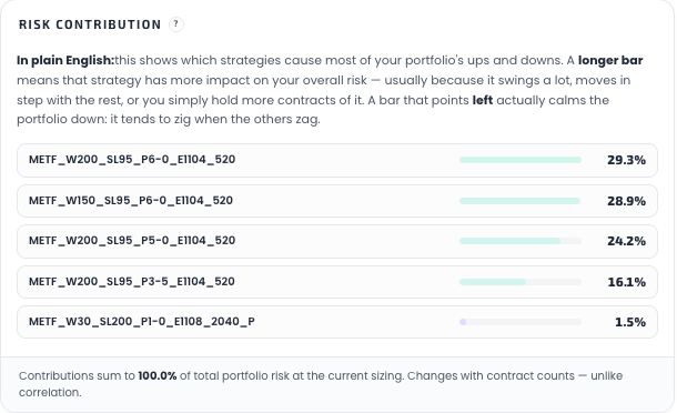
"Which strategies are actually driving my swings?" A horizontal bar per strategy showing how much of the portfolio's total risk each one accounts for at the contract counts you currently hold. The shares sum to 100%.
This panel appears when you switch to Advanced. Like the rest of that toggle, it is a display setting available on every plan — it reveals analytics over your own selection, and unlocks nothing.
How it's computed, per the panel's own help text: the covariance of each strategy's daily profit/loss with the whole portfolio's daily profit/loss, divided by the portfolio's variance, with your contract counts baked in. It is built from realized daily P/L over the analysis period — not from a strategy's width, stop loss, premium, or single worst day. Those parameters matter only through their effect on the daily numbers.
Reading it:
- A long bar means that strategy drives a lot of the portfolio's movement — because it swings hard, because it moves in step with everything else, or simply because you hold more contracts of it.
- A bar pointing left is negative: that strategy hedges the book. It tends to move opposite the rest and lowers total variance.
- Bars are coloured by strategy family; the footer states what the shares sum to at your current sizing.
The property that makes it worth having: unlike Strategy Correlation above, which never changes with sizing, this does react to contract counts. Double a strategy's contracts and its share rises. Correlation tells you which strategies are the same bet; Risk Contribution tells you which one is currently the loudest — and that is a question about your sizing, not about the strategies.
It describes your selection over the chosen window. It is not a forecast of which strategy will drive risk next month.
Get the weekly 0DTE research email
Research notes and product updates, straight to your inbox. Unsubscribe anytime.