
Stress Testing — Monte Carlo
The Monte Carlo tab resamples your portfolio's daily P/L into thousands of equity paths — judge the distribution of outcomes, not one lucky history.
One backtest is one path — the sequence of days that happened to occur. The Monte Carlo simulation, the second tab of the Portfolio workspace, resamples your portfolio's historical daily P/L with replacement into thousands of alternative paths, so you can see the distribution: the median outcome, the tails, and above all the drawdowns you'd need to sit through.
Why this matters for 0DTE portfolios
Credit-spread portfolios have a characteristic shape: many small winning days, occasional sharp losing days. Whether a given sequence of those days feels survivable depends heavily on their order — the same set of trading days rearranged can produce a gentle year or a brutal quarter. That's sequence risk, and it's invisible in a single backtest. Resampling makes it visible: across thousands of orderings you see the realistic range of drawdowns, not just the one that history happened to produce.
What the simulation does, in one paragraph
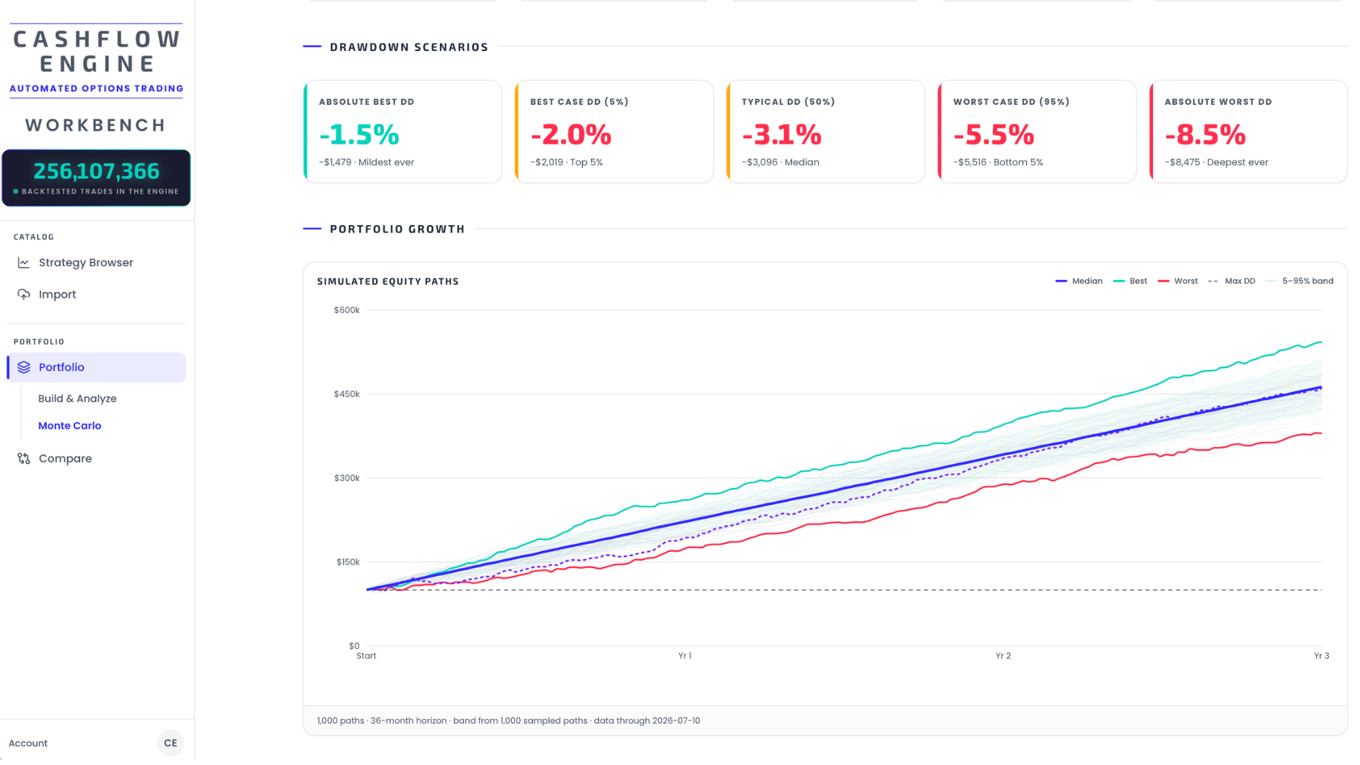
Each simulation draws N random days from your portfolio's daily-P/L pool (N = horizon ÷ 12 × 252 trading days) and accumulates them onto your initial capital — one equity path. Across all paths, the app takes the 5th/50th/95th percentiles at each step for the band chart, every path's terminal value for the return scenarios, and every path's max drawdown for the drawdown scenarios. Optionally, it injects worst-case events into every path — either your portfolio's real worst day, or a theoretical simultaneous max loss.
What the percentages mean
Every result is labelled with a percentage — 5%, 50%, 95%. These are percentiles: they rank the thousands of simulated futures from worst to best and point at one position in that ranking. They are not probabilities of a particular event, and not a confidence rating.
Line up 1,000 simulated outcomes from worst to best, then:
| Label | Position in the ranking | Read it as |
|---|---|---|
| 5% | the 50th-worst outcome | "5% of futures were worse than this" — a bad-but-not-catastrophic case |
| 50% (median) | the middle one | "half were better, half were worse" — the typical case |
| 95% | the 50th-best outcome | "only 5% were better" — a good case, not a target |
So a Worst Case (5%) return isn't the worst thing that can happen — it's the line beneath which the worst 1-in-20 futures live. Likewise Worst Case DD (95%): 95% of simulated futures had a shallower drawdown than that, and one in twenty had a deeper one. That's the number to size against — not the median, which by construction you'll be worse than half the time.
The 5–95% band on the chart is just those two lines drawn at every point in time: the middle 90% of simulated futures lived inside it.
The pages in this section
- Running a simulation — every setting: simulations, horizon, initial capital, and the stress injection with its two worst-case modes.
- Reading the results — the key metrics, the return and drawdown scenario cards, the equity-path band chart and the distributions.
- Limitations & caveats — what resampling can and cannot tell you. Read this one; it's short and it's the honest part.
Get the weekly 0DTE research email
Research notes and product updates, straight to your inbox. Unsubscribe anytime.