
Metrics table & overlays
Every row of the side-by-side comparison table, the equity and drawdown overlay charts, and the strategy overlap view.
The metrics, row by row
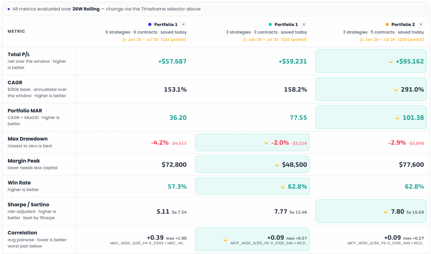
| Row | What it compares | Best = |
|---|---|---|
| Total P/L | Net P/L over the shared window. | Highest |
| CAGR | Annualized growth on a $100k base — the common base makes different account sizes comparable. | Highest |
| Portfolio MAR | CAGR ÷ Max Drawdown — return per unit of drawdown. | Highest |
| Max Drawdown | Deepest peak-to-trough decline, in % and $. | Closest to zero |
| Margin Peak | Largest single-day margin used — lower needs less capital. | Lowest |
| Win Rate | Winning spread-legs ÷ total legs. | Highest |
| Sharpe / Sortino | Risk-adjusted return, both flavors stacked; the star goes by Sharpe. | Highest |
| Correlation | Average pairwise correlation between the portfolio's strategies, with the worst pair named underneath — so you know exactly which two picks move together. | Lowest |
| Total Trades | Sample size behind all of the above. | No winner — but small samples make every other row less trustworthy. |
Reading tip: scan for the portfolio whose stars span return and risk and capital rows. And check Total Trades before celebrating — a stellar MAR on 40 trades is a rumor, not a result.
Overlays
Screenshots of the overlay charts and the overlap table are being captured.
Two charts render all compared portfolios on shared axes:
- Equity Curves — one line per portfolio, all normalized to a $100k start so different account sizes and P/L scales compare fairly, with an optional dashed SPX benchmark and a drag-to-zoom range selector. The footer names which portfolio ended highest.
- Drawdown Profiles — each portfolio's running drawdown on a shared percentage axis. The footer names who stayed shallowest and who dipped deepest. This chart usually decides the comparison: equity curves flatter, drawdown profiles confess.
Strategy Overlap
The Which Strategies Appear Where table lists every strategy across the compared portfolios with a column per portfolio — tabs switch between All strategies and Only overlaps. If two portfolios share most of their strategies, their comparison is really about sizing, not construction; the overlap view tells you which conversation you're having.
Get the weekly 0DTE research email
Research notes and product updates, straight to your inbox. Unsubscribe anytime.